Power BI
Internal tool
Role: Senior UX Designer
Company: Sage
Team: Strategic Services - AI squad
Context
Power BI is an internal tool used to visualise analytical data and create ad hoc reports. Originally designed and built by the Service Fabric team, it had several issues: usability limitations, poor accessibility, and overly complex functionality.
Task
Power BI needed a redesign, and I was assigned this project. My responsibilities included understanding the specific needs of the users within the organisation, creating a user-friendly navigation and architecture, improving usability and accessibility, and enhancing the site's visual appeal.
Actions
To gather insights, I interviewed the team's director, three Project Managers and a Solution Designer who had been using Power BI. Through these discussions, I identified two types of reports they used: executive and service reports. Using this information, I began designing the visual elements for the widgets, drawing inspiration from examples I found online.
I analysed how each report page should be structured and decided to include an overview section and a specific section for each dimension. I also considered the types of graphs to use and whether each widget should be configurable. This led me to develop two options.
I believed option 1 was the best, as it allowed users to configure both individual widgets and the entire page. However, I presented both options for a vote at one of our weekly design critique meetings, and the response was unanimous.
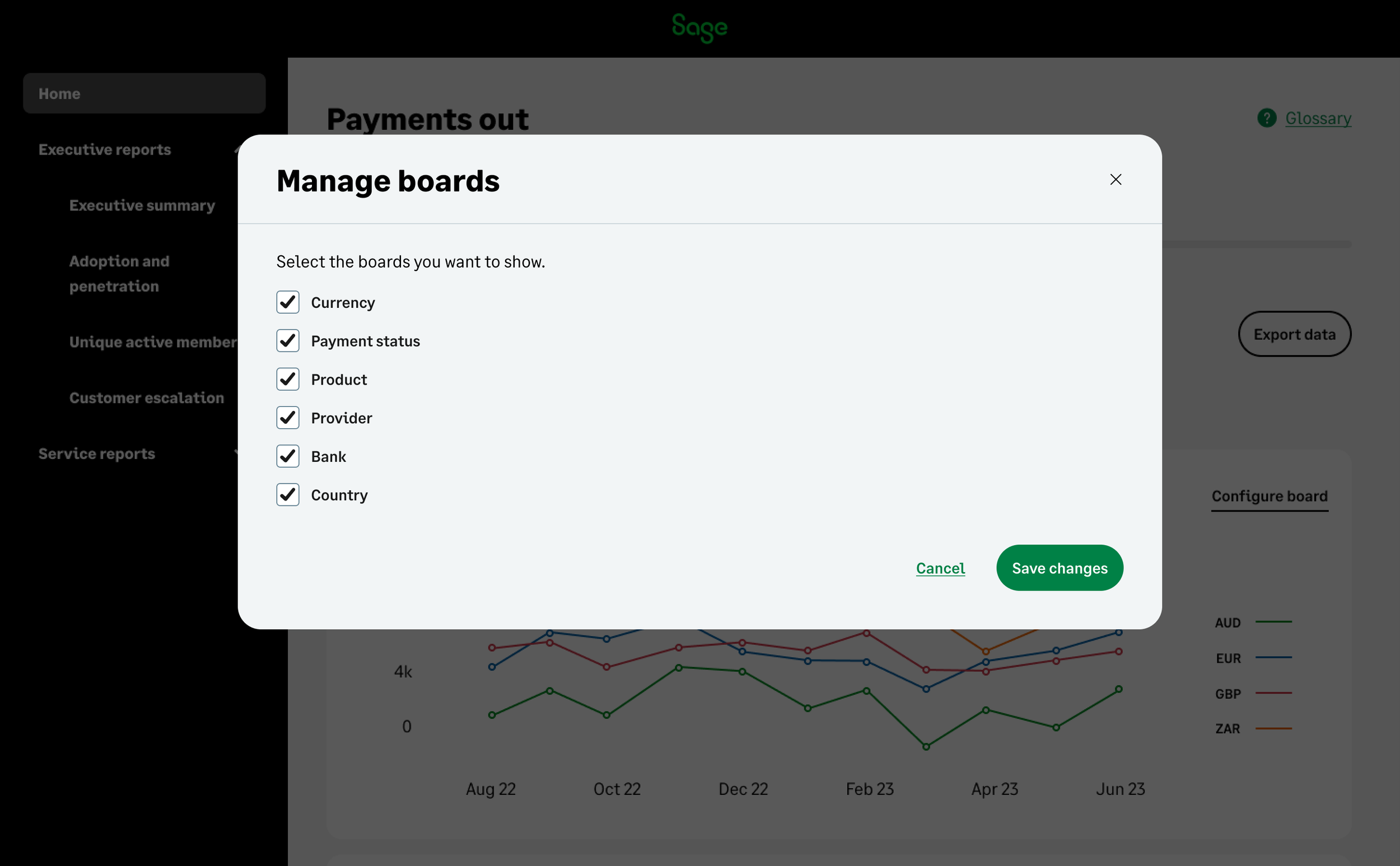
Further refinements included details such as configuration screens specific to each graph and the option to export a report from the dashboard.
Results
Throughout my work, I shared my progress with both the solution designer and the project manager. Once they were satisfied with the work, user stories were written, and I created specifications for the development team. The final result was the deployment of the new Power BI website.


